Prodigy Design System

Empowering employees through the implementation of accessible platforms.
Prodigy Design System

Empowering employees through the implementation of accessible platforms.

Prodigy Design System

Empowering employees through the implementation of accessible platforms.

Prodigy Design System

Empowering employees through the implementation of accessible platforms.

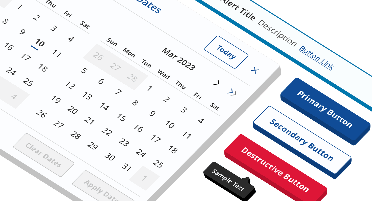
Isometric image of different design system components

Client:

H - Hotels

Role:

Lead UI Designer

Year:

2023

About Prodigy

Prodigy is an accessible design system (2.1 AA level) used on H-Hotels' internal platforms. Its look and feel are appealing, easy, and fresh. Thanks to its design, based on the POUR accessibility principles (Perceivable, Operable, Understandable, Robust), it has helped to transform complex systems into user-friendly and seamless platforms that can be used by a broad audience.

Prodigy is an accessible design system (2.1 AA level) used on H-Hotels' internal platforms. Its look and feel are appealing, easy, and fresh. Thanks to its design, based on the POUR accessibility principles (Perceivable, Operable, Understandable, Robust), it has helped to transform complex systems into user-friendly and seamless platforms that can be used by a broad audience.

Challenge

H-Hotels noticed that new employees had a steep learning curve when using inventory management platforms, which consumed a significant amount of time. To facilitate all related activities, they decided to pursue a complete redesign of their internal platforms, requesting the development of a new Design System that could be used by all employees.


Design System requirements:


  • Adhere to the WCAG 2.1 AA success criterion to ensure accessibility for a broad audience.


  • Incorporate insights derived from the UX research, and account for technical constraints as communicated by the developers.


  • Use Figma's properties, such as auto layout, variants, instances, and booleans to facilitate the work for the UX team and UI developers.


  • Use Tailwind CSS framework.


To meet the project timeline, the library needed to be completed within two months, prior to the UX team starting work on the mockups.

Steps taken to address projects goals
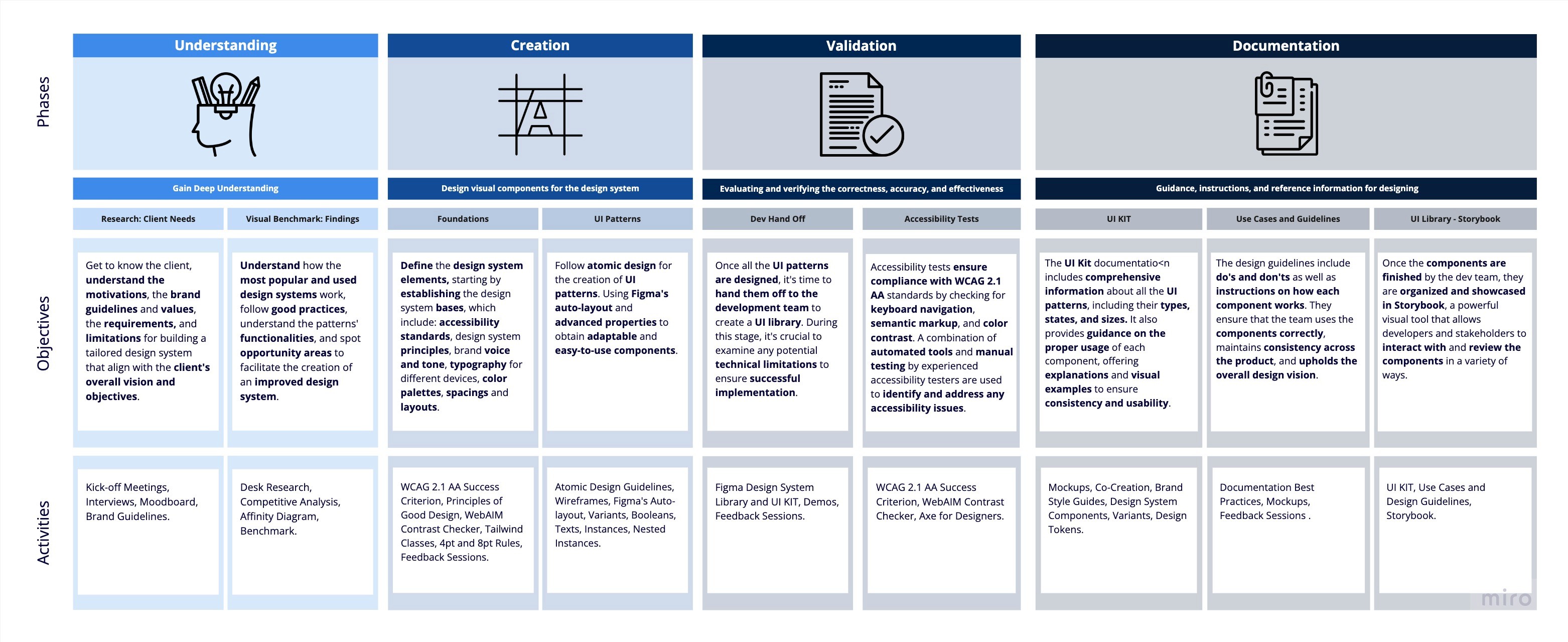
A graphic representation of the phases, objectives and activities of the process we stablished and follow for developing the design system.

  • We started the project by understanding the client's needs, requirements, limitations, and the set of components that were needed.


  • We read WCAG 2.1 AA recommendations to meet the requested accessibility level.


  • We tested the existing client’s brand guidelines and UI library to address the design and accessibility debts.


  • We conducted a competitive analysis of the most used design systems to identify best practices, trends, and opportunity areas and gather inspiration for the creation of our design system.


  • Beyond the client's component list, our UX researchers revealed additional components that we considered necessary to enhance the user experience.

A fragment of the tabs competitive analysis.

Tabs section and its findings from the competitive analysis.
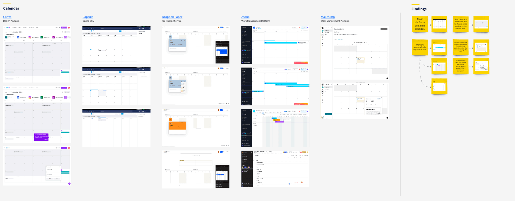
A fragment of the calendar competitive analysis.

Calendar section and its findings from the competitive analysis.

The solution

We designed a UI kit that included different properties for each component, such as variants, states, statuses, sizes, and colors. Complex elements were presented with detailed use cases to provide a clear understanding of their intended use.


This allowed us to create a well-defined guideline that established best practices for utilizing each component.
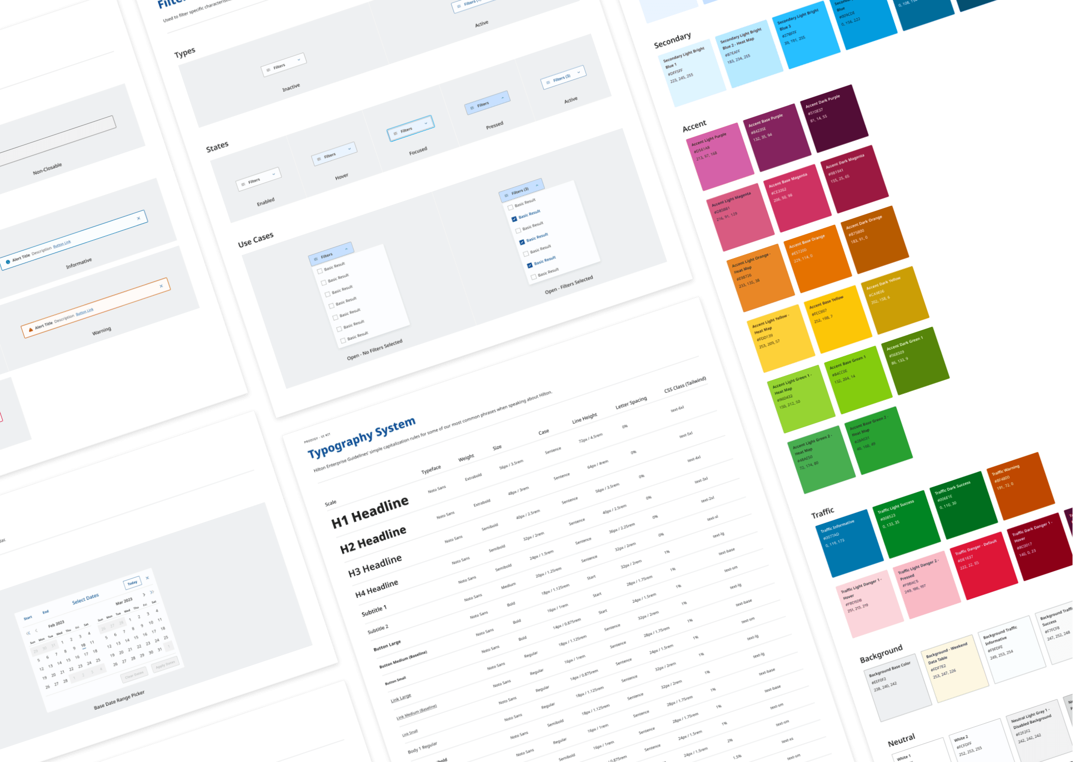

A composition of different screes from the UI Kit.

Some screens taken from the UI Kit. Part of the typography system and the color palette can be appreciated.

Some screens taken from the UI Kit. Part of the typography system and the color palette can be appreciated.

We used atomic design for developing the library. Started with easy components to complex ones. When establishing the foundations of the design system, we drew inspiration from Dieter Rams' 10 principles of good design.
We used atomic design for developing the library. Started with easy components to complex ones. When establishing the foundations of the design system, we drew inspiration from Dieter Rams' 10 principles of good design.

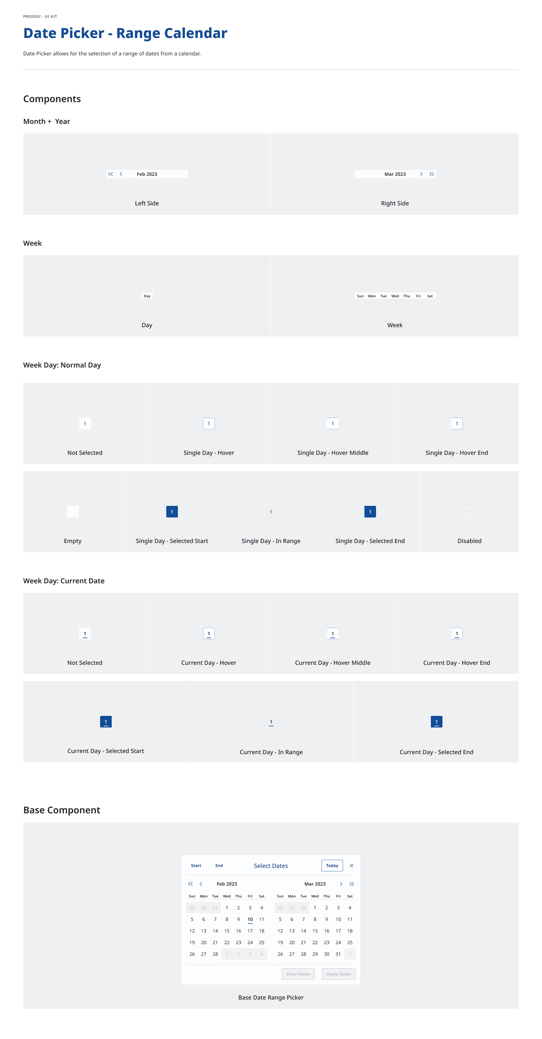
Date Picker - Range Calendar components.

Figma properties (auto layout, booleans, instances, nested instances, texts, etc.) were applied to each component. We decided to create three size variants (small, medium, and large) to ensure adaptability.


Alongside our developers, each component was tested to ensure it accomplishes accessibility standards.
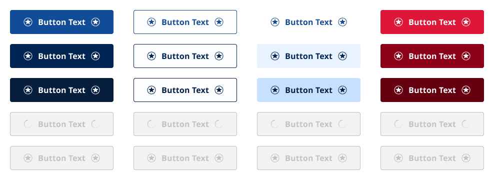

Different button types.

Incorporating two icons in buttons granted UX and UI designers the flexibility to select from using a basic button, a button with a leading icon, a button with a trailing icon, or an icon-only button, as demonstrated in the image below.

Incorporating two icons in buttons granted UX and UI designers the flexibility to select from using a basic button, a button with a leading icon, a button with a trailing icon, or an icon-only button, as demonstrated in the image below.

Basic button variants.

Achievements

  • The project was delivered on time, although the documentation for new components was scheduled for a later date.


  • The color palette was expanded in order to validate the components' statuses. Traffic colors now help on preventing and communicate errors.


  • The design system meets the WCAG 2.1 level standards and embodies accessibility fundamental principles: perceivability, operability, understandability, and robustness.


  • By prioritizing the completion of design components, the platform flows were expedited, resulting in a faster overall completion time.


  • H-Hotels expressed an interest in adopting the new design system as a solution to address design debt across other platforms.

My Learnings

  • It is nice to follow the guidelines from other design systems, but it is essential to improve components and align them to the product's goal.


  • Led the efforts of a system that represented a new challenge for me was the best option to improve my technical skills. Since I read the WCAG considerations, I got impressed by what accessibility represents, I read about ADA accessibility standards as well to understand better what is commonly missing when developing digital products.


  • If all projects took action on accessibility considerations from the start, more people would use the products. We should focus on learning more about accessibility.

Let’s

work

together

I'm currently looking for new challenges so if you want to take your business to the next level, let's talk! I'm ready to turn your ideas into reality.

Naila's UI/UX Portfolio

Let’s

work

together

I'm currently looking for a new challenge, let's talk and work together!

Naila's UI/UX Portfolio